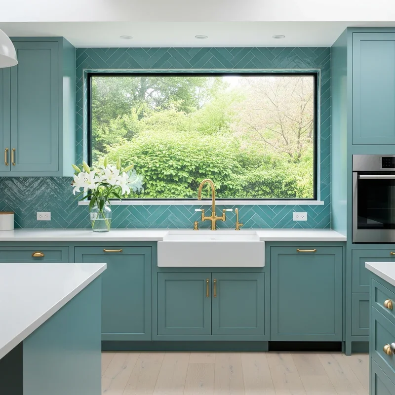
Turquoise kitchen cabinets are having a major moment, and for good reason. This vibrant, balanced hue blends the calm of blue with the freshness of green, creating a look that’s both energizing and soothing. Whether you’re renovating a coastal cottage or giving a modern condo kitchen a pop of personality, turquoise cabinets can transform your space into something truly special. More than just a trend, they’re a design choice that adds character, reflects light beautifully, and works across a range of styles, from farmhouse to contemporary.
You don’t have to go all-in to make an impact. Even a turquoise kitchen island or upper cabinets can become the focal point of your room. When paired thoughtfully with neutrals, warm woods, or metallic accents, turquoise brings depth and dimension without overwhelming the space. In this guide, you’ll discover practical, stylish ways to incorporate turquoise cabinetry into your kitchen, complete with color pairings, finish ideas, lighting tips, and layout strategies that ensure your design feels cohesive and timeless.
Choose Your Turquoise Style

Match Your Design Aesthetic
Turquoise is surprisingly versatile. It fits seamlessly into multiple interior styles, each with its own flavor:
- Coastal: Think white walls, natural wood countertops, and brass hardware. Turquoise mimics ocean waves, enhancing that breezy, beach-house vibe.
- Modern: Pair matte turquoise shaker cabinets with sleek quartz countertops and minimalist chrome handles for a clean, contemporary edge.
- Eclectic: Mix turquoise lowers with patterned backsplashes and bold art. Combine textures like rattan bar stools and terracotta tiles for visual excitement.
- Farmhouse: Use turquoise on open shelving or a kitchen island, paired with reclaimed wood and apron-front sinks for rustic charm.
- Two-Tone Contemporary: Try turquoise uppers with white lower cabinets. This combo adds drama while keeping the space feeling grounded.
The key is consistency. Let turquoise be the star, but support it with finishes and furnishings that align with your chosen style.
Pick the Right Finish
The finish you choose changes how turquoise feels in your kitchen:
- Matte: Soft, sophisticated, and glare-free. Ideal for modern or farmhouse kitchens. Adds depth without shine.
- Glossy: Reflective and energetic. Bounces light around, making small kitchens feel larger. Best for contemporary spaces.
- Semi-Gloss: A middle ground that’s easy to clean with a subtle sheen. Great for high-traffic kitchens.
For shaker-style cabinets, a matte turquoise finish with simple, flat-panel doors creates a timeless look. Add recessed lighting above to highlight the texture and color tone throughout the day.
Plan Your Color Strategy
Pair With Neutral Walls
Keep walls neutral to let turquoise cabinets shine. Avoid competing colors and stick to:
- Crisp white for a fresh, airy contrast
- Light gray for a modern, understated backdrop
- Soft beige or cream to warm up the cool tone of turquoise
- Charcoal gray for high-contrast drama
Paint sample swatches on multiple walls and observe them in morning, noon, and evening light. Natural light shifts the appearance of turquoise. What looks teal at noon may read greener in low light.
Combine With Smart Countertops
Your countertop choice balances the boldness of turquoise:
- White quartz or marble – Classic, clean, and bright. The go-to for modern and coastal kitchens.
- Natural wood countertops – Warm and organic. Perfect for rustic or farmhouse styles. Teak or walnut tones offset the coolness of turquoise beautifully.
- Concrete or gray granite – Adds industrial edge. Works well in eclectic or urban lofts.
Avoid busy patterns. Opt for solid or lightly veined surfaces to keep focus on the cabinets.
Select Harmonizing Hardware
Hardware ties the look together. Choose based on your style:
- Brass or gold – Adds warmth and luxury. Ideal for coastal or vintage-inspired kitchens.
- Brushed nickel or chrome – Sleek and modern. Complements glossy turquoise cabinets.
- Matte black – Bold contrast. Works with dark turquoise shades for a dramatic effect.
Keep hardware style consistent. Don’t mix finishes unless you’re intentionally layering in an eclectic design.
Explore Layout Ideas
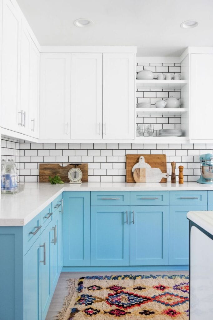
Go Full Turquoise for Impact
Paint all cabinets in a rich turquoise for a bold, statement-making kitchen. This works best in:
- Open-concept spaces where the kitchen flows into living areas
- Well-lit rooms with large windows or skylights
- Modern homes aiming for a vibrant, curated look
Balance the boldness with white or light gray walls, neutral flooring like light wood or white oak, and a simple backsplash such as white subway tile or glass.
Pro tip: Use a slightly darker turquoise on lower cabinets and a lighter shade on uppers to create visual depth.
Use Turquoise on the Kitchen Island
For a subtler approach, apply turquoise only to the island. This creates a focal point without overwhelming the space.
Design tips:
- Keep perimeter cabinets white, gray, or wood-toned
- Match island hardware to other cabinet pulls for cohesion
- Add pendant lights with turquoise glass shades to echo the color
This method is ideal for renters or those hesitant about commitment. You get maximum style with minimal risk.
Try Two-Tone Turquoise Cabinets
Create visual interest with a two-tone layout:
- Turquoise uppers, white lowers – Lifts the eye, makes ceilings feel higher
- White uppers, turquoise lowers – Grounds the space, adds boldness at floor level
- Turquoise uppers, wood-tone lowers – Blends cool and warm for a balanced look
Add a complementary backsplash in soft gray, cream, or terracotta tile to link the two tones seamlessly.
Balance With Backsplash and Flooring

Choose a Complementary Backsplash
Your backsplash bridges cabinets and walls. Great options include:
- White subway tile – Timeless, clean, and reflective
- Soft gray glass tile – Adds subtle texture without competing
- Terracotta or blush pink zellige – For eclectic or Mediterranean flair
- Natural stone or marble – Elegant and organic
Avoid turquoise tile unless it’s a small accent. Too much of the same color can feel monotonous.
Pick the Right Flooring
Flooring should ground the design, not clash with it:
- Natural wood floors – Warm and inviting. Light oak or walnut enhances the coastal or rustic feel.
- White oak or bleached wood – Keeps the space airy and modern.
- Neutral tile or stone – Durable and low-contrast. Ideal for high-moisture areas.
Avoid dark floors with dark turquoise cabinets. They can make the room feel heavy. If you love dark flooring, lighten walls and countertops to compensate.
Add Finishing Touches
Incorporate Turquoise Through Accessories
Not ready for painted cabinets? Introduce turquoise through:
- Bar stools with turquoise seats – Subtle but effective
- Turquoise dishware or glassware – Display in open shelving
- Small appliances – Toaster, blender, or mixer in turquoise
- Rugs or curtains – Tie the color into the full kitchen zone
These accents let you test the color before committing. They’re also easy to change later.
Use Lighting to Enhance the Hue
Lighting affects how turquoise appears:
- Warm white bulbs (2700K to 3000K) – Soften the coolness, create a cozy feel
- Pendant lights with turquoise glass – Reinforce the theme and add ambient glow
- Under-cabinet lighting – Highlights countertops and reflects off glossy cabinets
Install dimmers to adjust brightness and mood throughout the day.
Bring in Greenery and Texture
Plants breathe life into turquoise kitchens:
- Place potted herbs on the windowsill
- Hang ferns or pothos near open shelves
- Use ceramic planters in white, terracotta, or turquoise to echo the color scheme
Natural textures like woven baskets, linen towels, or wooden cutting boards add warmth. They prevent the space from feeling too clinical.
Avoid Common Mistakes
Overloading With Color
Turquoise is bold. Don’t pair it with other strong hues unless you’re aiming for eclectic chaos. Stick to a 60-30-10 rule:
- 60% neutral (walls, floors, countertops)
- 30% turquoise (cabinets or island)
- 10% accent (hardware, decor, textiles)
This ensures balance and visual comfort.
Ignoring Lighting Conditions
Turquoise can shift from blue-green to teal depending on light. Always:
- Test paint samples on multiple cabinet doors
- Observe at different times of day
- Consider window direction (north light is cool, south is warm)
If your kitchen lacks natural light, opt for a lighter turquoise or use it only on the island.
Choosing Clashing Hardware
Mismatched metals disrupt cohesion. Decide on a metallic theme and stick to it:
- Warm metals (brass, gold) – Best with warm countertops and wood tones
- Cool metals (chrome, nickel) – Pair with white or gray surfaces
- Mixed metals – Only if intentionally layered (e.g., brass pendants over chrome cabinet pulls)
Avoid mismatched finishes unless you’re confident in eclectic styling.
Maximize Small Kitchen Appeal

Make Space Feel Larger
Turquoise can actually enhance small kitchens when used wisely:
- Pair light turquoise cabinets with white walls and countertops
- Use glossy finishes to reflect light
- Install glass-front uppers to break up solid color
- Add vertical stripes or open shelving to draw the eye upward
Avoid dark turquoise in windowless kitchens. It can feel cave-like.
Use Vertical Color Blocking
Try:
- White uppers, turquoise lowers – Grounds the space
- Turquoise uppers, white lowers – Draws the eye up, adds airiness
- Half-and-half with a trim line – Adds architectural interest
This technique adds personality without sacrificing function.
Maintain a Timeless Look
Avoid Trend-Driven Extremes
While turquoise is on-trend, you can design it to last:
- Choose classic cabinet styles (shaker, flat-panel) over ultra-modern shapes
- Stick to versatile shades (medium turquoise, teal) over neon or pastel extremes
- Pair with enduring materials (quartz, wood, ceramic tile)
This way, your kitchen stays fresh for years, not just seasons.
Update Easily With Accents
Because turquoise is bold, it pairs well with rotating decor:
- Swap out towels, rugs, and dishware seasonally
- Change bar stool cushions for holidays or spring refreshes
- Update wall art to keep the vibe current
This keeps your kitchen feeling new without a full remodel.
Frequently Asked Questions About Turquoise Kitchen Cabinets
What colors go best with turquoise kitchen cabinets?
White, light gray, soft beige, and cream are the top wall colors. For countertops, white quartz or marble works beautifully. Warm wood tones and brass or gold hardware balance the coolness of turquoise effectively.
Should I paint all my cabinets turquoise or just the island?
Both options work well. Full turquoise application creates a bold statement, while a turquoise island with neutral perimeter cabinets offers a subtler focal point. If you’re hesitant, start with the island to test the color.
Does turquoise make a small kitchen feel smaller?
No, turquoise can actually make small kitchens feel larger when paired with light elements. Use light turquoise shades, glossy finishes, and white walls or countertops. Avoid dark turquoise in windowless spaces.
What hardware finishes work with turquoise cabinets?
Brass and gold add warmth and luxury. Chrome and brushed nickel offer a clean, modern complement. Matte black creates bold contrast. Choose one metallic theme and stay consistent throughout the kitchen.
Can turquoise cabinets work in a farmhouse-style kitchen?
Yes, absolutely. Pair turquoise with natural wood elements, rustic accessories, and matte finishes. An apron-front sink, reclaimed wood open shelving, and warm countertops complete the farmhouse look.
How do I prevent turquoise cabinets from looking overwhelming?
Use the 60-30-10 rule. Keep 60% of the space neutral, 30% turquoise, and 10% accent colors. Keep countertops and flooring simple. Add greenery and natural textures to soften the bold hue.
Key Takeaways for Designing With Turquoise Kitchen Cabinets
Turquoise kitchen cabinets offer a rare blend of boldness and balance. The color’s versatility allows implementation across various design styles, from coastal to modern, with numerous pairing options to achieve the desired aesthetic. Whether you go all-in with full turquoise application or use the color as a strategic accent on an island, the key is harmony.
Remember these essentials:
- Pair turquoise with neutrals like white, gray, beige, or warm wood tones
- Choose finishes wisely – matte for depth, glossy for light reflection
- Test colors in real lighting before committing to paint
- Balance boldness with simple countertops, flooring, and backsplashes
- Use hardware to elevate the design with brass, chrome, or matte black
Your next step is simple. Grab paint swatches, test them on your cabinet doors, and observe how the light changes the color throughout the day. With thoughtful planning, your turquoise kitchen won’t just turn heads. It’ll feel like home.