
Your kitchen feels flat and generic because every cabinet matches, leaving the space lacking depth and personality. Applying two-toned kitchen cabinets ideas instantly solves this by layering distinct colors to create a dynamic, curated environment that feels custom-designed.
This guide reveals how to balance bold accents with neutral backdrops using the professional 70/30 rule. You will learn specific layout strategies, undertone matching techniques, and lighting tips to transform your kitchen into a stylish, functional hub.
Select the Perfect Layout Strategy for Your Space

Choosing the right configuration determines whether your kitchen feels balanced or chaotic. Different layouts serve unique functional needs and aesthetic goals within your home.
Dark Base with Light Upper Cabinets
This timeless arrangement grounds the room while keeping the ceiling line open and airy. Paint lower units in charcoal, navy, or espresso, then pair them with crisp white or soft gray uppers.
* Why it works: Light uppers reflect illumination to make ceilings feel higher.
* Best for: Classic, Transitional, and Minimalist styles.
* Pro Tip: Use a satin finish on dark lowers to hide fingerprints in high-traffic zones.
Dark Island with Light Perimeter Units
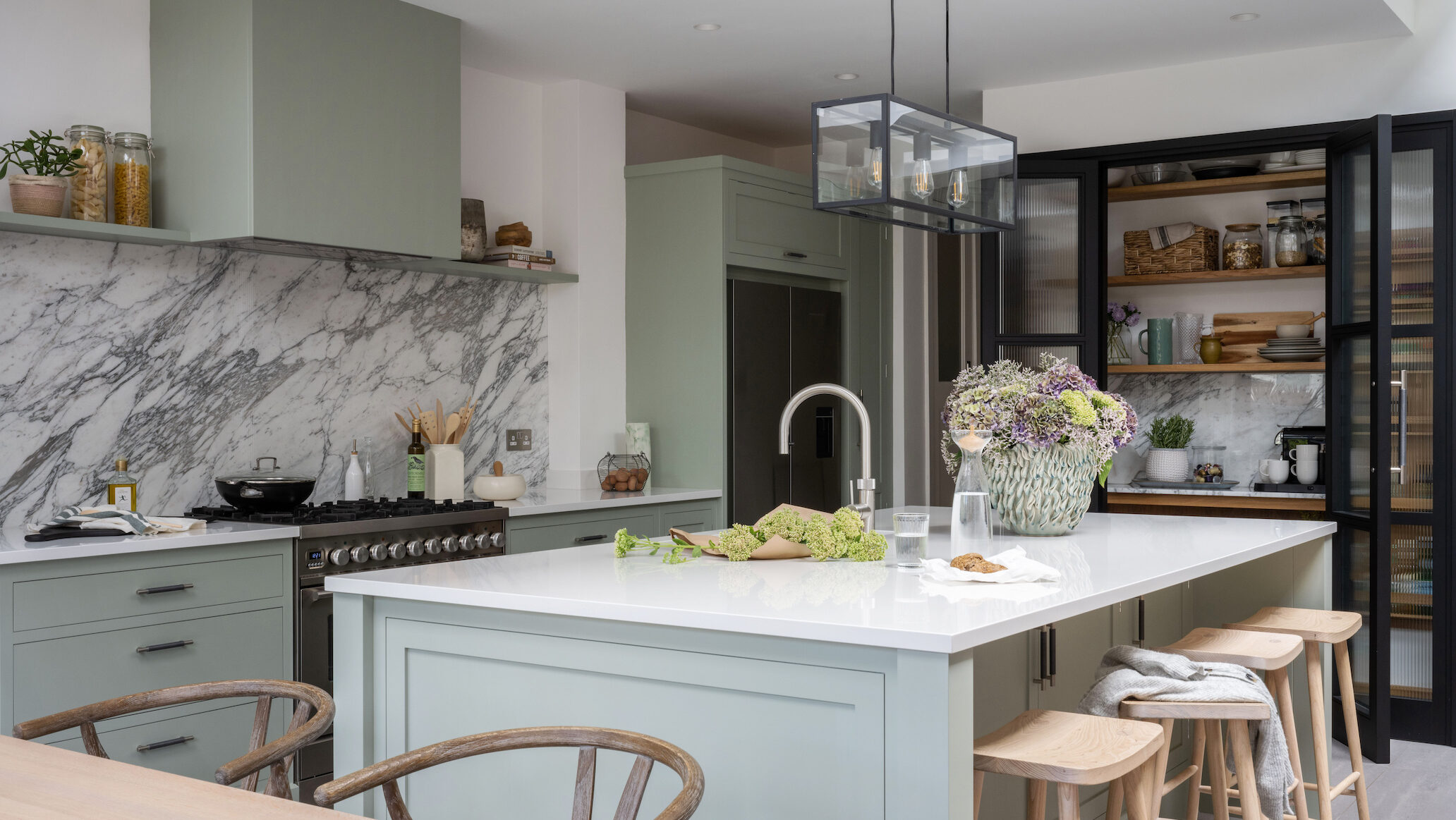
Make your island the undeniable focal point by finishing it in a bold hue like deep blue or forest green. Keep the surrounding perimeter cabinets light to maintain an open flow.
* Visual Cue: Ensure your countertop bridges both tones, perhaps using warm wood or veined quartz.
* Best for: Open-concept living areas needing zone definition.
Statement Tool Units and Pantry Cabinets
Apply dramatic colors selectively to functional zones like appliance garages or pantry runs. This method adds texture and interest without disrupting the main sightlines of the room.
* Strategy: Treat a walnut pantry run or sage green appliance column as built-in art.
* Mistake to Avoid: Do not place contrasting units in awkward spots where they look random.
Light Lower with Wood Upper Combinations
Combine painted cabinetry with natural wood to introduce organic warmth and texture. You can pair crisp white bases with natural oak uppers for a Nordic feel.
* Alternative: Use warm timber lowers with cream uppers for a rustic yet modern foundation.
* Time Note: Sourcing matched wood units may add one to two weeks to your timeline.
Apply the 70/30 Rule for Visual Balance

Even beautiful colors clash if you do not proportion them correctly. The industry-standard 70/30 rule ensures your two-toned kitchen cabinets ideas remain harmonious rather than overwhelming.
Why the Ratio Matters
Seventy percent of your cabinetry should feature a neutral, dominant tone. The remaining thirty percent serves as an accent color to create focal points without visual chaos.
* The Risk: A 50/50 split often feels jarring and overly dramatic.
* The Solution: Let one color dominate to create a sense of intentionality.
How to Calculate Your Surface Area
Start by estimating your total cabinet surface area to assign colors accurately.
1. Assign 70% to neutral shades like white, cream, or soft gray.
2. Assign 30% to bold tones such as navy, charcoal, or walnut.
3. Apply the accent color to the island or lower cabinets only.
Expert Note: In smaller kitchens, restrict the accent color to the island to maintain balance without crowding the space.
Match Undertones for a Cohesive Look
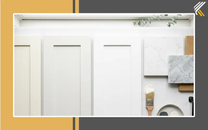
Every color possesses hidden undertones that dictate how it interacts with neighboring hues. Ignoring these subtleties is the fastest way to ruin an otherwise perfect design.
Warm vs. Cool Differences
You must categorize your chosen shades to ensure they harmonize effectively.
* Whites: Cool whites have blue bases, while warm whites lean yellow or creamy.
* Grays: Cool grays contain blue or purple hints, whereas warm grays have beige undertones.
Critical Warning: Never pair a warm white with a cool gray, as the result will appear muddy and disjointed.
Testing Undertones Effectively
Hold your cabinet samples together in natural light to spot subtle shifts. Use a pure white sheet of paper as a neutral backdrop to compare the true nature of each color.
* Action Step: Stick to one undertone family unless you are intentionally creating high contrast.
* Pairing Rule: Match warm whites with warm woods and cool grays with stainless steel.
Optimize Colors Based on Lighting Conditions
Your kitchen’s orientation dictates which colors will thrive and which will fail. Natural light intensity changes how paint and finishes appear throughout the day.
North-Facing or Low-Light Kitchens
These spaces often feel cold, so you must avoid deep, cool tones on large surfaces. Dark colors here can make the room feel smaller and significantly dimmer.
* Strategy: Use light, warm neutrals like cream or soft beige on most cabinets.
* Accent Idea: Add contrast with a warm wood island or sage green tool unit.
* Result: The room feels brighter and more inviting.
Well-Lit or South-Facing Kitchens
Abundant sunlight allows you to embrace bold, rich colors without fear of heaviness. Deep hues gain depth and sophistication when illuminated by strong natural light.
* Bold Choices: Try deep navy, black, or forest green for dramatic effect.
* Finish Tip: Matte finishes perform beautifully here, offering elegant texture without glare.
Test Materials Together Before Committing
Your cabinets do not exist in isolation, so their success depends on interaction with other elements. You must evaluate how finishes interact with countertops, flooring, and walls.
The Holistic Sampling Process
Gather physical samples of every material in your kitchen ecosystem before making a final decision.
* Required Items: Both cabinet finishes, countertop slab, flooring sample, and wall paint.
* Hardware: Include knobs and pulls to see the full picture.
On-Site Testing Protocol
Lay all samples together on your actual kitchen floor or countertop. Observe them at morning, noon, and evening to see how lighting changes their appearance.
* Why It Matters: A navy cabinet might clash with warm oak floors only visible in person.
* Warning: Never finalize colors based on small showroom swatches alone.
Explore Proven Color Combinations
Specific pairings have stood the test of time and offer reliable results for various styles. These combinations provide a solid foundation for your two-toned kitchen cabinets ideas.
Black and Natural Wood
This sophisticated pairing creates a rich, grounded look ideal for luxury or urban lofts. Matte black lowers paired with natural oak uppers soften the bold base with warmth.
* Hardware Tip: Use matte black or brass pulls to unify the aesthetic.
* Balance: Opt for white quartz countertops to prevent the space from feeling too dark.
White and Navy
A crisp, timeless combination that works beautifully in bright, contemporary settings. White uppers reflect light while navy lowers add strong definition and character.
* Longevity: Navy is a classic accent that does not date like trendier neon or pastel options.
* Backsplash: White subway tile with brass grout adds subtle warmth.
Cream and Sage Green
Create a serene, organic atmosphere with this calming pairing perfect for cottage or Scandinavian homes. Cream cabinets provide a soft base while sage introduces an earthy tone.
* Vibe: Ideal for homeowners seeking a spa-like, tranquil kitchen environment.
* Pairing: Butcher block counters and matte black fixtures enhance the natural feel.
White and Natural Oak
Maximize light and texture with this effortless, fresh combination suitable for Nordic styles. White painted lowers keep the base clean while natural oak uppers add grain.
* Benefit: Perfect for small kitchens needing brightness without sterility.
* Care: Apply wood protectant to oak surfaces to prevent staining.
Dusty Pink and Walnut
An unexpected yet elegant choice for warm, designer spaces seeking unique character. Dusty pink lowers paired with walnut uppers create an inviting and soft palette.
* Requirement: Keep walls and countertops neutral to let these colors shine.
* Lighting: Best suited for well-lit kitchens where the pink retains its vibrancy.
Avoid Common Two-Tone Mistakes
Many homeowners stumble on simple errors that disrupt the visual flow of their new design. Awareness of these pitfalls ensures your project succeeds.
Ignoring the 70/30 Balance
Equal distribution of color is the most frequent error, leading to a jarring 50/50 split. Always ensure one color clearly dominates the space.
* Fix: Reassign the accent color to a single element like the island.
Mixing Conflicting Undertones
Combining cool whites with warm woods creates visual tension that feels “off.” Audit every material to ensure they belong to the same undertone family.
* Solution: Stick to all warm or all cool tones unless creating deliberate contrast.
Overlooking Hardware and Lighting
Mismatched hardware finishes break cohesion between the two cabinet tones. Choose one finish, such as brass or satin nickel, and use it throughout.
* Lighting: Install layered lighting to highlight both cabinet tones evenly.
Consider Cost and Longevity Factors
Understanding the financial and temporal implications helps you plan a realistic budget for your renovation. While some manufacturers charge a premium, many do not.
Will Two-Tone Cost More?
Some suppliers add a 5% premium for processing two different cabinet finishes. However, standard colors often incur no extra charge.
* Variables: Custom colors or specialty finishes may increase costs.
* Advice: Ask suppliers directly about dual-color fees before ordering.
Are Two-Tone Kitchens Timeless?
The strategy itself is enduring, though specific color choices carry different risks. Navy, charcoal, and natural wood age gracefully over decades.
* Risky Choices: Ultra-trendy pastels or neon accents may date quickly.
* Verdict: Neutral dominance ensures your kitchen remains stylish for years.
Frequently Asked Questions About Two-Toned Kitchen Cabinets
Can two-tone cabinets make a small kitchen look bigger?
Yes, painting upper cabinets a light color reflects light and draws the eye upward. This creates an illusion of height, making compact spaces feel more expansive and open.
What is the most popular color combination for two-tone kitchens?
White uppers paired with navy or charcoal lowers remain the most popular choice. This classic combination offers strong contrast while maintaining a timeless, versatile appeal.
Do I need to change my hardware when going two-tone?
You do not need to change hardware, but you should ensure the finish complements both cabinet colors. Using one consistent metal finish throughout ties the two tones together effectively.
How do I choose which cabinets get the accent color?
Apply the accent color to areas you want to highlight, such as the island or lower cabinets. Keep the majority of the cabinetry neutral to maintain visual balance and prevent clutter.
Will two-tone cabinets go out of style soon?
The concept is a lasting design strategy, not just a fleeting trend. As long as you choose classic accent colors like navy or wood, the look will remain sophisticated and relevant.
Key Takeaways for Successful Two-Toned Kitchen Cabinets Ideas
Creating a stunning kitchen requires more than just picking two colors; it demands strategic balance and thoughtful coordination. By adhering to the 70/30 rule, matching undertones carefully, and testing materials in your specific lighting, you ensure a harmonious result. These two-toned kitchen cabinets ideas transform flat spaces into dynamic environments that reflect your unique style.
Start by gathering physical samples and evaluating your kitchen’s natural light before making any purchases. Whether you choose a bold island or a classic dark-base layout, intentionality is your most powerful tool for a timeless design.